Creative Process
Projects
· Business Cards
· Case Studies
· Client Portal
· Direct to Client Emails
· Logo & Branding
· Pitch Decks
· Website
· White Papers
design
Digital & Print

Print Ad
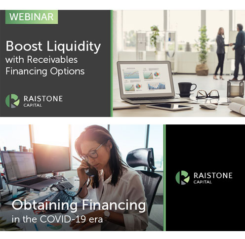
Email Headers
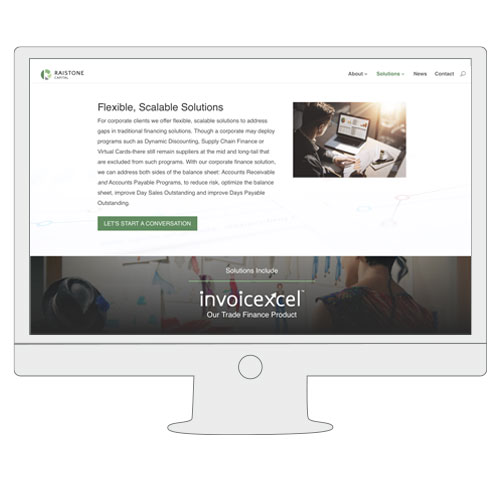
Website


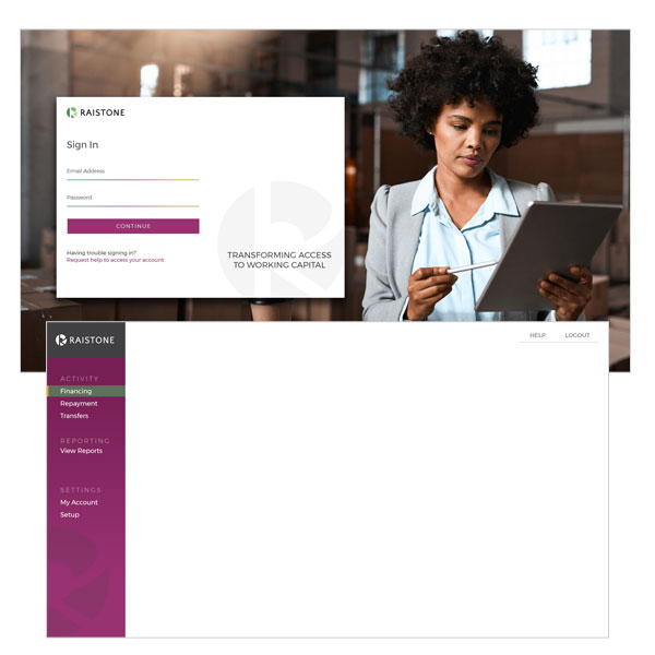
brand
Logos & Style Guide
One of the most challenging projects, for both new and established companies, is branding. Logos are tough because they need to convey a big message in a compact package.
The Directive: Create a logo that conveyed an established presence while not seeming too stuffy or traditional. AltFi is becoming a popular financing option that offers alternative solutions to traditional methods.
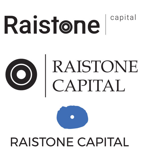
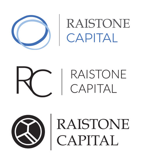
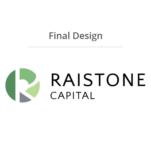
The iterations show some stages of the logo design process. The options were narrowed down to either the literal representation of a Rai Stone or a graphic that alluded to finance. The final logo came about when I took the original idea of a Rai Stone (a stone used as currency that had a hole in the middle) and placed an uppercase “R” over that. The result is a graph-like logo that hints at the original stone with the negative space of the “R” within.
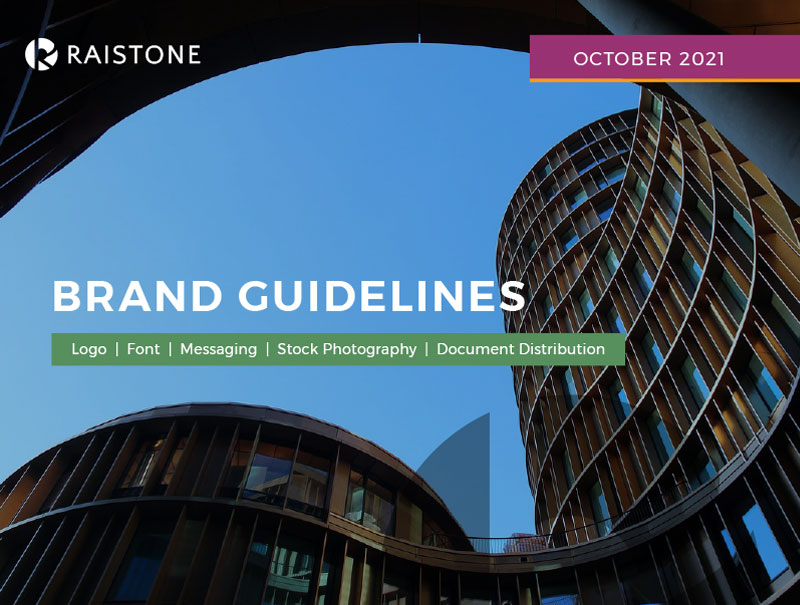
The style guide was updated in 2021 as the brand needed a fresh look. I chose secondary colors of purple and dark yellow to liven up the traditional green/money connection.